



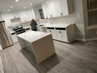
Choosing a countertop you love is one thing. Making sure it works with your cabinets, flooring, and backsplash is another.
The key is coordination rather than exact matching. Start with the elements that are already fixed, choose a visual anchor, keep undertones compatible, decide how much contrast you want, and avoid having too many surfaces compete for attention. Before making a final decision, compare your cabinet, countertop, flooring, and backsplash samples together in the lighting of the actual room.
Here’s how to bring those choices together.
Start With What You Can’t Easily Change
There isn’t one correct order for choosing kitchen finishes. The right starting point depends on your project.
If you’re remodeling around existing cabinets or flooring, those surfaces should guide the new selections. Replacing a countertop is much easier than changing hardwood floors throughout an adjoining space simply because their undertones don’t work with the new design.
For a completely new kitchen, you have more flexibility. You might begin with the cabinetry, or a distinctive granite or quartzite slab may become the visual anchor for the entire room. Beyond appearance, how you use the kitchen can also influence the material decision; different countertops suit different cooking habits depending on priorities such as durability, heat resistance, and everyday maintenance.
A useful approach is to identify three things first:
- Which finishes are staying?
- Which selection has the least flexibility?
- Which element do you want to make the strongest visual statement?
Once those decisions are clear, the other surfaces become easier to coordinate.
Match Undertones Before You Match Colors
Two finishes can technically be the same color and still look wrong together.
The reason is often the undertone.
Whites, grays, beiges, woods, and even seemingly neutral countertop colors can lean warm or cool. A creamy white cabinet, for example, may feel disconnected beside an icy gray countertop even though both appear neutral when viewed separately.
Look beyond the dominant color of the countertop. Consider the background, veining, mineral variation, and smaller colors running through the surface. Those details can provide a visual connection to cabinetry, flooring, or other finishes.
Natural wood cabinets deserve particular attention because wood already contains variation and movement. Rather than trying to duplicate the wood’s exact color in the countertop, look for compatible undertones that allow the two materials to complement each other.
Decide Between Contrast and Continuity
Once the undertones work together, decide whether you want the kitchen to feel more contrasting or continuous.
Contrast makes individual elements easier to distinguish. Dark cabinetry paired with a lighter countertop can visually separate the surfaces, while white cabinets with a darker countertop can create a stronger focal point.
A lower-contrast palette creates a softer transition. Light cabinetry with a light countertop, for example, can produce a bright, continuous look without everything needing to be exactly the same shade.
Neither approach is inherently better.
Consider the size of the room, available natural light, cabinetry, and the overall feeling you want to create. A combination that looks dramatic in a large, bright kitchen may feel much heavier in a smaller space with limited daylight.
Balance Pattern and Movement
Color isn’t the only consideration. Pattern and movement can have just as much influence on whether kitchen finishes work together.
A dramatic quartzite or granite slab with sweeping veins can become the focal point of the room. Pairing it with an equally busy backsplash, strongly patterned floor, and pronounced cabinet grain can make each individual finish compete for attention. The variation and character that make these surfaces distinctive are part of the broader appeal—and practical tradeoffs—of natural stone countertops.
Instead, decide where you want the strongest movement.
If the countertop is the feature, quieter surrounding finishes can give the stone room to stand out. If you’ve already chosen an expressive backsplash or highly figured cabinetry, a more restrained countertop may provide better balance.
This is especially important with natural stone because every slab is different. The scale and direction of the veining across a full slab can have a much greater visual impact than a small sample suggests.
Coordinate Countertops With Your Cabinets
Cabinetry occupies a large portion of the kitchen, so it naturally plays an important role in choosing a countertop color.
| Cabinet direction | Countertop consideration |
| Warm white or cream | Look for compatible warm backgrounds, minerals, or veining. |
| Crisp white | Can support cooler neutrals, subtle patterns, or stronger contrast. |
| Natural wood | Consider both the wood undertone and the amount of visible grain. |
| Dark cabinetry | Lighter countertops can provide contrast and visual separation. |
| Two-tone cabinets | Look for a surface that relates naturally to both cabinet finishes. |
These aren’t rigid design rules. A particular slab, cabinet finish, room, or lighting condition can change how a combination appears.
Material characteristics matter as well as color. For example, two light natural stones can create a similar overall design direction while behaving quite differently in everyday use, as the differences between marble and quartzite countertops illustrate.
The best combination balances appearance with how the finished kitchen countertop needs to perform within the space.
Bring the Flooring Into the Same Palette
Flooring is sometimes overlooked because it isn’t directly connected to the countertop, but it is one of the largest surfaces in the room.
If the flooring is staying, treat it as a fixed part of the palette from the beginning.
With wood floors, pay attention to both undertone and grain. Wood cabinetry and wood flooring do not necessarily need to match—and making them too similar can sometimes flatten the design. A little contrast can help distinguish the surfaces while compatible undertones keep them connected.
Also consider adjoining rooms. In an open floor plan, the countertop may need to work with flooring and finishes visible well beyond the kitchen itself.
Choose the Backsplash After the Bigger Decisions
In many projects, the backsplash is easiest to finalize after the cabinets, countertop, and flooring are established.
It can then act as a connecting element.
A simple backsplash can give a strongly patterned countertop space to stand out. Alternatively, a quieter countertop can support more color, texture, or pattern on the wall.
You can also pick up a secondary tone from the countertop’s veining or mineral pattern without trying to duplicate it exactly.
Another option is continuing the countertop material onto the backsplash, creating a more uninterrupted surface and allowing the slab itself to become a larger part of the design. Backsplash configuration, material thickness, corners, sinks, and other choices are among the practical countertop design decisions that are best considered before templating and fabrication.
See the Whole Slab, Not Just a Sample
Samples are useful for comparing colors and undertones, but they don’t always tell the complete story—particularly with natural stone.
A small piece of quartzite, granite, or marble may show the general colors while revealing very little about the movement, veining, and variation across the full slab. The Natural Stone Institute’s guidance on stone selection likewise emphasizes aesthetic variation and the limitations of relying on individual samples when evaluating natural material.
That’s why seeing the actual slab matters.
At Valley View Granite, digital layout technology can also help visualize how a selected slab will be positioned across the finished countertops. This provides a better understanding of how prominent veins, patterns, seams, and other characteristics may appear before fabrication begins.
It turns the decision from simply choosing a stone into considering how that stone will actually become part of the room.
Compare Everything in Real Lighting
Before approving your final combination, put the materials together.
View countertop, cabinet, flooring, and backsplash samples under both natural and artificial light whenever possible. Colors that look balanced in a brightly lit showroom can appear warmer, cooler, darker, or more muted in your kitchen.
Look at the combination at different times of day and from different positions in the room. Small finishing choices can change the overall effect too; even countertop edge profiles can make a surface feel more streamlined, substantial, traditional, or contemporary.
Most importantly, don’t judge each finish independently. The goal isn’t to find four perfect individual materials. It’s to create one kitchen where all four work together.
Valley View Granite’s countertop material options provide different combinations of color, movement, performance, and design flexibility, making the final selection as much about how the surfaces work together as how any single material looks on its own.





